
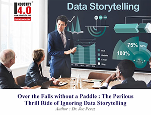
When Dreams Vanish: The Mercury Locomotive and Data Visualization
Key Takeaway:
The short but brilliant life of the Mercury Locomotive is full of information that can be gleaned for those who struggle with data and seek to shine through it. Four secret best practices of the Mercury Locomotive shine through in its history: Streamlining, Storytelling, Sophistication, and Shift, which this article will connect with data storytelling.
A Train That Promised Tomorrow
Imagine what the world was like in 1936. The Depression was still a reality, but there was hope in the air and a hunger in the heart of America for something new and exciting. Then, almost out of nowhere, comes the Mercury; a sleek, metallic train developed by the New York Central Railroad and the vision of the great industrial designer, Henry Dreyfuss. Its speed, beauty, and futuristic design completely enthralled the public. People gathered trackside just to watch it flash by. The press called it the “Train of Tomorrow,” and for a little while, it truly felt as though tomorrow had arrived.

Besides being both fast and beautiful, the Mercury’s interiors felt like private clubs, with curved sofas, pastel carpets, and indirect lighting that made traveling feel like an event. Panoramic windows and even an onboard speedometer made the journey functional and interactive. Dreyfuss and his team took tired old commuter cars and reimagined them into something that still looks modern in old photographs.
Yet, as dazzling as it was, the Mercury didn’t last. A mix of unlucky accidents, the explosion of highway travel, the lure of automobiles, and the slow unraveling of passenger rail spelled its doom. Today, you won’t find a Mercury in any museum. It survives only in stories, photos, and a handful of design blueprints.
I’ve spent half my life working with data; translating it, visualizing it, and teaching others how to do the same. When I read about the Mercury, I’m struck by how its rise and fall mirror the challenges and opportunities we face with data visualization. Both fields are about more than just tools or technology; both are about making information meaningful and lasting. Let’s look at four big lessons (the “Four S’s”) that the Mercury’s story offers us.
Streamlining: The Power of Elegant Simplicity
The Mercury is a lesson in cutting the fat. Dreyfuss didn’t simply graft a new, glamorous body onto an old train; he remade every inch of it, every detail, in the pursuit of speed. The train appeared to be in motion, even when it stood stationary. There was no wasted space; no clutter.
In data visualization, for example, the tendency is to include all information; even every detail that can be represented graphically. Let’s face it: in the effort to unlock insights through analytics tools, it is all too common for us to be presented with a set of graphs that looks like those of a jumbo jet’s control panel and for our eyes to glaze over in the process. Consider the last chart you looked at that made you go, “Aha!” Chances are, it was clean, focused, and direct. It didn’t waste your time.
Let’s be practical here. Suppose you are developing a sales dashboard for a sales team that simply wants to know whether they’re winning or losing for the quarter. Would you embed 15 different types of graphs into it, ranging from conversion metrics to customer churn and web traffic to social media interactions? Or would you highlight only those two or three key numbers that actually drive their decisions? Which approach is more likely to get used? Which one will people remember when they’re walking out of the meeting? Most of us are looking for clarity rather than complexity.
Streamlining involves honoring the time and mental energy of your audience, not overwhelming them with a bloated visualization. If you’ve ever watched a team leader sigh with relief when you present a simple, crystal-clear chart, you already know the power of this principle. The Mercury’s curves were pretty, but they also made the train faster and more efficient. In the same way, a streamlined visualization helps ideas travel farther, faster.
Storytelling: Turning Data into Narrative
Climb aboard the Mercury in its heyday, and it was more like entering a story than merely boarding a train. The publicity, the art deco, and the club-like atmosphere all contributed to creating an experience in which passengers believed themselves to be part of something greater than themselves. The Mercury route was an experience of motion and modernity rather than just an entry on a schedule.

Data, by itself, can be relatively dull. Most people aren’t excited about rows of statistics or generic percentages. Put all that same data into the context of a story, with a beginning, a plot, and an ending, and all of sudden people care about it. They remember it. They respond.
This is something I recommend to beginners: before you even make your chart, ask yourself, “What is the headline?” What is one thing you want someone to extract after viewing your chart? When you can determine that, you have half of what it takes to make a great story. With headlines like, “The sales are up sharply after the summer dip.” and “Customer complaints rising in the Northeast,” this chart is now your proof, your evidence, your punchline.
Let’s say you’re presenting quarterly results to your team. You could bombard them with graphs, or you could walk them through a simple sequence: “Here’s where we started the year. Here’s what changed (maybe a new marketing campaign, a competitor entering the market, a product launch). Here’s the result.” Now you’ve got a story, not just a report. Stories stick. People walk out of the room repeating them to others. That’s what the Mercury did in its day, and it’s what great data visualization does now.
Sophistication: Advanced Techniques for Deeper Insight
Innovation ran deep in the Mercury’s veins. Roller bearings, air conditioning, and the combination of design and mechanics made the Mercury one of the most advanced trains of its period. However, all this culminated on one point: providing the passenger with a smooth ride.
In data visualization, the array of available tools grows every year. There are interactive dashboards that let you slice and dice data on the fly, predictive models that show possible futures, and visualizations that reveal relationships you might never spot in raw numbers. But here’s the trick I’ve learned over the years: sophistication only matters if it helps the person on the other end.
Ever gotten lost in a chart with six axes, color gradients, and moving parts? If so, you know that complexity can quickly become a barrier. Advanced techniques are fantastic—when used with care. For example, an interactive map might let a logistics manager spot a supply chain bottleneck the moment it appears. Or a confidence interval on a forecast chart can help a decision-maker understand not just what might happen, but how certain (or uncertain) that prediction really is.

If you’re wondering whether to use a complex visualization, try showing it to someone who isn’t in your department. Do their eyes light up? Or do they squint, frown, or quietly ask for the spreadsheet instead? The Mercury’s designers didn’t add features just because they could; each innovation connected directly to passenger experience. Likewise, data visualization should let the insight take center stage, not the technology.
Sometimes, the most “sophisticated” thing you can do is make something look simple. That’s a lesson the Mercury would have understood.
Shift: Adapting to Technological and Cultural Change
No matter how brilliant, every innovation faces the tides of change. The Mercury’s moment in the sun was short-lived, however; not because of any failing in its design but due to the change that came about in the world around it. Highways crisscrossed the continent, and cars became more and more within the reach of the common man. This resulted in railroads losing their romance in favor of the freedom of the road. Eventually, the train’s routes became reduced, and its sleek exterior became history.
People familiar with the world of data analysis for more than a few years will recognize the changes I speak of. Remember the days of reports printed and bound in books and distributed by hand? Or when business intelligence meant emailing around Excel files with cryptic file names? The shift to web-based dashboards, real-time updates, and mobile access has changed not just how we visualize data, but who can do it and when.
We’re living through another shift right now. Artificial intelligence, machine learning, self-service analytics: all these things are opening doors that would not have been open a decade ago. The skill set that you needed to have in 2016 may not be as valuable as the skill set that you have or need to develop today. However, regardless of the tools that you use, the principles remain the same: understand who you’re speaking to, be responsive to them, and don’t get fixed on a particular process.
I frequently ask colleagues, “What’s the one tool you couldn’t live without five years ago but barely touch now?” Change is relentless. The Mercury’s story stands as a warning: don’t let yesterday’s brilliance turn into tomorrow’s relic. Stay open and willing to learn; you’ll be finding new ways to make data matter.
Bringing It All Together: The Mercury’s Enduring Lessons
Key Finding:
The Mercury Locomotive’s journey offers us a framework for building data visualizations that last, inspire, and drive real-world results.
So, what does it all add up to? The Mercury’s rise and fall is a reminder to carefully consider the things we build and why we build them. The greatest data visualizations, like the greatest trains, are more than just something to impress people with for a brief moment before fading away into obscurity.
Here’s a quick recap of the four “S” lessons:
Streamlining: Cut the clutter, keep what’s important, and respect your audience’s time.
Storytelling: Wrap your data in a narrative people can follow and remember.
Sophistication: Leverage sophisticated tools only when it helps the user understand.
Shift: Stay alert to changes in technology and culture, and don’t be afraid to adapt.
As a data professional, you’re more than a number cruncher. You’re an architect of understanding with the goal of connecting numbers to decisions and actions in the real world. Sometimes you’re honored and recognized; other times, you’re the catalyst in the background. Both roles matter.
Though the Mercury is long gone, its spirit lives on every time someone transforms a chaotic mess of data into something clear, useful, and even beautiful. Every struggle to explain, to tell a story, to innovate, and to adapt is a small homage to that forgotten train. The quest to make sense of the world continues, and you’re a part of it.
Summary Box:
The Mercury Locomotive’s story is an amazing analog for data visualization. Streamlining, storytelling, sophistication, and shift: when we use these concepts in creating data visualizations, we ensure our work remains relevant, impactful, and sustainable, no matter how the landscape changes.
If you ever find yourself doubting whether your latest dashboard or visualization will last, look to the Mercury. Ask yourself: does this make the journey easier for my audience? Am I adjusting to new realities? Am I telling a story worth remembering? The answers will guide you, just as they guided the designers who brought the Mercury to life, if only for a while.
Banner Image : AI generated by Google Gemini
“Bringing Data to Life and Life to Data”
 About the Author:

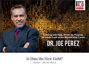
Dr. Joe Perez,
Team Lead / Senior Systems Specialist,
NC Department of Health and Human Services
![]()
Dr. Joe Perez ( Dr.Joe ) is also the Chief Technology Officer – CogniMind
To book Dr. Joe Perez for your speaking engagement please click here

Dr. Joe Perez was selected as the 2023 Gartner Peer Community Ambassador of the Year.
Dr. Joe Perez is a truly exceptional professional who has left an indelible mark on the IT, health and human services, and higher education sectors. Dr. Joe Perez journey began in the field of education, where he laid the foundation for his career. With advanced degrees in education and a doctorate that included a double minor in computers and theology, Dr. Joe Perez embarked on a path that ultimately led him to the dynamic world of data-driven Information Technology.
In the early 1990s, Dr. Joe Perez transitioned into IT, starting as a Computer Consultant at NC State University. Over the years, Dr. Joe Perez’s dedication and expertise led to a series of well- deserved promotions, culminating in his role as Business Intelligence Specialist that capped his 25 successful years at NC State. Not one to rest on his laurels, Dr. Joe Perez embarked on a new challenge in the fall of 2017, when he was recruited to take on the role of Senior Business Analyst at the NC Department of Health & Human Services (NCDHHS). His impressive journey continued with promotions to Senior Systems Specialist and Team Leader, showcasing his versatility and leadership capabilities.
In addition to his full-time responsibilities at NCDHHS, Dr. Joe Perez assumed the role of
fractional Chief Technology Officer at a North Carolina firm in October 2020. An Amazon best-selling author with over 21,000 followers on LinkedIn and numerous professional certifications, he is a highly sought-after international keynote speaker and recognized expert in data analytics and visualization.
Dr. Joe Perez’s contributions have not gone unnoticed. Dr. Joe Perez is a recipient of the IOT Industry Insights 2021 Thought Leader of the Year award, the 2023 Gartner Peer Community Ambassador of the Year award, and Top Ten Global Thought Leader for several categories at Thinkers360 in four consecutive years (2023-2026). Dr. Joe Perez holds memberships in several prestigious Thought Leader communities, and was recently inducted into the United Nations Global Network of Data Officers and Statisticians. Dr. Joe Perez’s reach extends to more than twenty countries worldwide, where he impacts thousands through his speaking engagements, articles, and status as a Distinguished Fellow in the Public Sector Network’s Future Government Institute.
Beyond his professional achievements, Dr. Joe Perez’s passion for teaching remains
undiminished. Whether as a speaker, workshop facilitator, podcast guest, conference emcee, or team leader, he continually inspires individuals to strive for excellence. He treasures his time with his family and is a gifted musician, singer, pianist, and composer. Joe also dedicates his skills through involvement in his church’s Hispanic ministry. Dr. Joe Perez manages the publication of a widely recognized monthly military newsletter, The Patriot News, and is deeply committed to his community.
To maintain a balanced life, Dr. Joe Perez is a regular at the gym, and he finds relaxation in watching Star Trek reruns. He lives by the philosophy that innovation is the key to progress, and he approaches each day with boundless energy and an unwavering commitment to excellence. Dr. Joe Perez’s journey is a testament to the remarkable achievements of a truly exceptional individual, and more importantly, to the amazing grace of God.
Dr. Joe Perez is Accorded with the following Honors & Awards :
https://www.linkedin.com/in/jw
Dr. Joe Perez is Bestowed with the following Licences, Certifications & Badge:
https://www.linkedin.com/in/jw
https://www.thinkers360.com/tl
Dr.Joe Perez is Voluentering in the following International Industry Associations & Institutions :
https://www.linkedin.com/in/jw
Dr.Joe Perez can be contacted at :
E-mail | LinkedIn | Web | Sessionize | FaceBook | Twitter | YouTube
Also read Dr.Joe Perez‘s earlier articles:


